
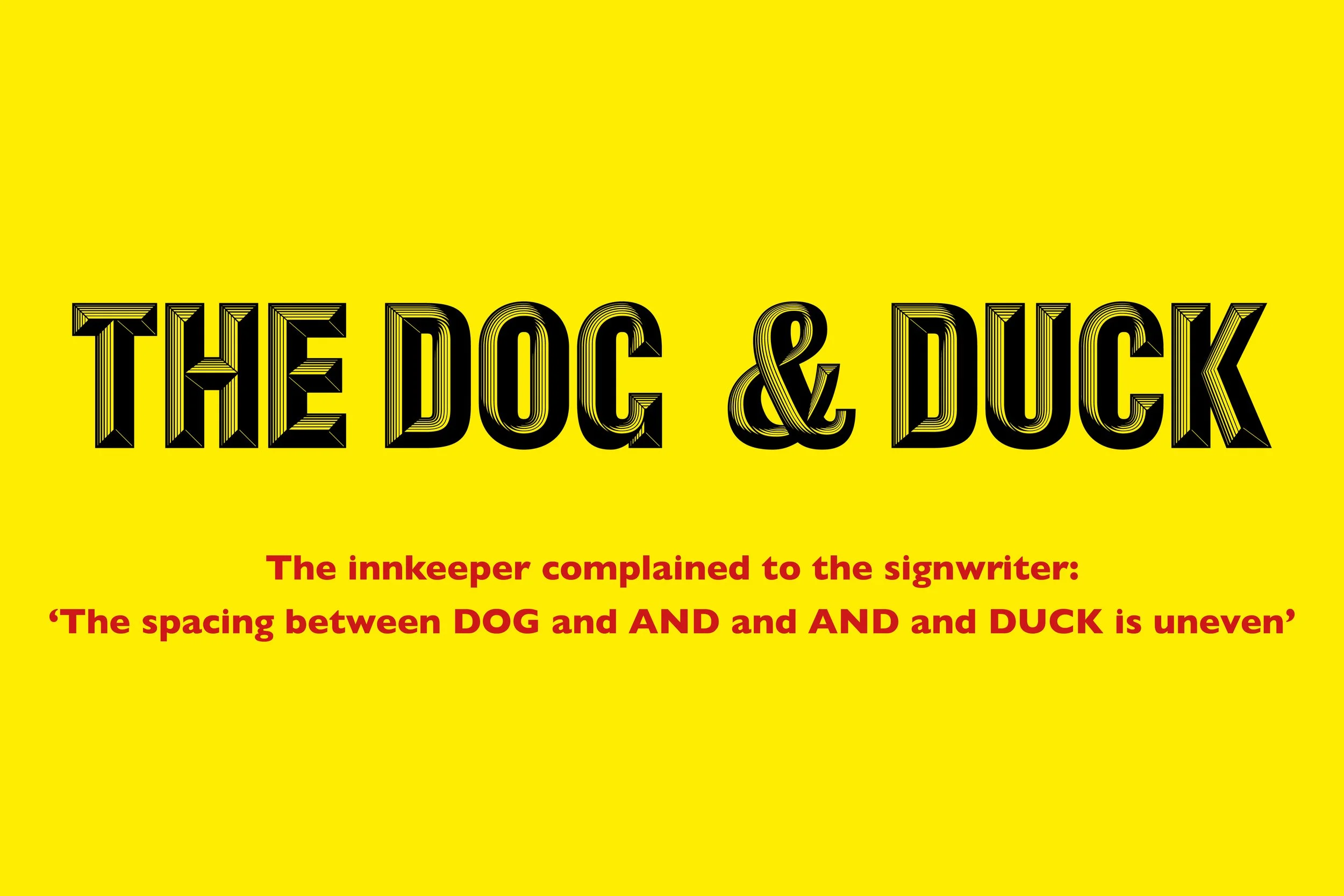
Here’s a little typographic quiz for you
What sentence in the English language uses the word ‘and’ five times consecutively?
It was a favourite of a dear friend of ours, Andy Altmann, who sadly passed away recently. Co-founder of maverick graphic communications studio Why Not Associates, Andy wasa generational creative talent who worked across the board for clients cultural and commercial, bringing a trademark edge, wit, deftness and daftness to books and posters, TV commercials, postage stamps and wayfinding systems.
Andy Altmann obituary from Creative Review, by friend and colleague Jim K Davies. November 2025.
Andy Altmann, who has died aged 63, was a generational creative talent. Best known for his influential, inventive and often irreverent work with Why Not Associates and the artist Gordon Young, he crested a new wave of exciting, progressive British graphic designers, many of whom graduated from St Martins School of Art and the Royal College in London in the late 1980s. He’s survived by his wife Justine, and sons Eddy and Callum.
Why Not ploughed its compelling, often trailblazing, furrow for three decades. One of the first UK studios to fully embrace the Apple Macintosh and multi-media, they consistently pushed the possibilities of print, photography, moving image, digital and three-dimensional design. The studio worked across the board for clients cultural and commercial, bringing their trademark edge, wit, deftness and daftness to books and posters, TV commercials, postage stamps and wayfinding systems.
One of my first encounters with Andy was at Archer Street Works, Soho, an unprepossessing warren of small creative studios, nestled between seedy pubs and seedier clip joints, where Why Not had first set up shop. I’d come to report on their latest Next catalogue work for the design and advertising magazine Direction. In the hands of Why Not, a humble mail-order catalogue had been magicked into a collectible artefact and major design event. A young, freshly graduated Jonathan Barnbrook was on placement there, bringing typographic flourishes to the cause.
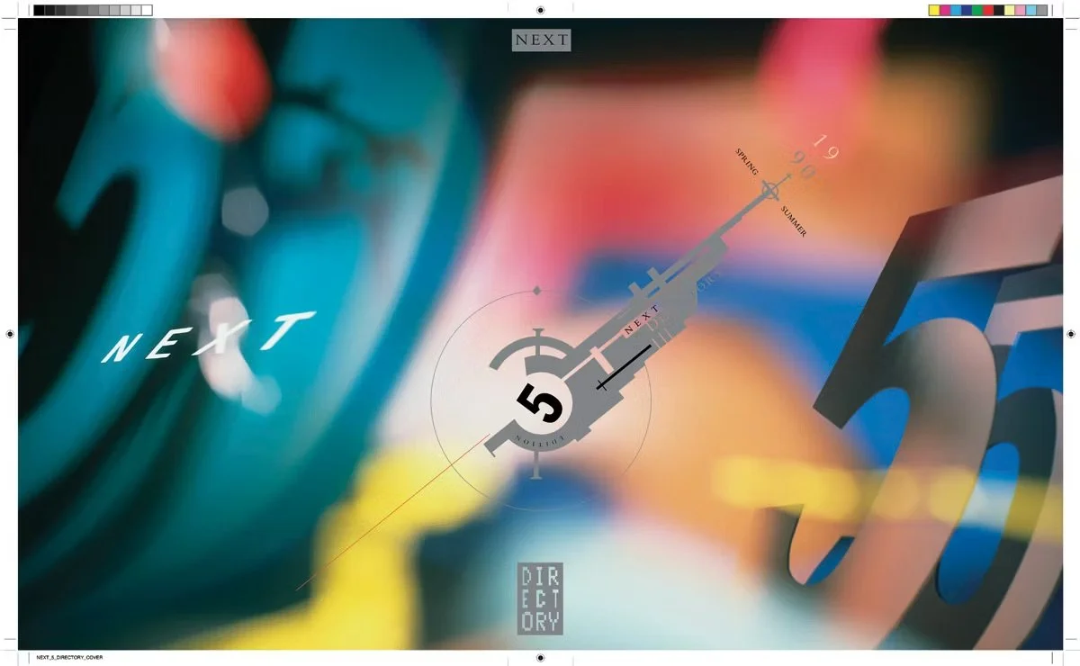
Cover for the Next Directory mail order catalogue, 1990
Back then in 1988 Why Nots were three – Andy, David Ellis and Howard Greenhalgh (who left shortly afterwards to pursue a career in the new-fangled field of pop videos). They’d met on the two-year RCA MA graphics course, under the professorship of Gert Dumbar, the charismatic maverick of Dutch graphic design. Dumbar made an immediate impression on his students by suggesting they install a studio fridge, which he made sure was always full of beer.
There’s no doubting that Dumbar had a profound influence on Andy (whom he always jokingly referred to as Altmann Andy, as per the official RCA register). Their paths had crossed earlier in 1983, when Andy attended the Dutchman’s student talk at St Martins School of Art.
“It was an hour of pure enlightened entertainment,” Andy recalled. “Gert was the first professional designer I’d met who seemed to be having unbelievable fun in every project he became involved in, no matter the client or content. I immediately felt a kindred spirit between us, particularly with his love of humour and the absurd.”
However, while Dumbar could only have come from the Netherlands, Andy was most definitely made in England – Warrington, Cheshire, to be precise. He was captivated by the great comedians of his childhood – Tommy Cooper, Ken Dodd, Morecambe and Wise, Spike Milligan and the rest. He relished the unpolished vernacular typography of 1970s, ‘so-bad-it’s good’ packaging, junk-shop oddities, old-fashioned Northernisms, wordplay and end-of-the-pier humour. This kind of whimsical graphic nostalgia would often creep into his work, giving it a quirky, personal twist.
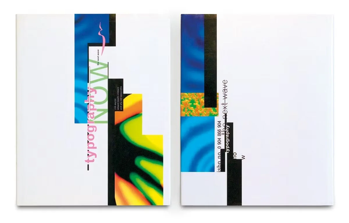
Cover for Typography Now by Rick Poynor, Booth-Clibborn, 1989
“I was a very serious young man,” admits Barnbrook. “Andy taught me that design could be playful without being arbitrary. He thought deeply about design, but that didn’t mean you couldn’t enjoy the ride or bring your own loves, as he did with comedy, into your work.”
With the notable exception of music, back then the industry was dominated by large, serious agencies serving the corporate machine. Early Why Not were seen as outsiders, buckers of the status quo. But they were always more mischievous than incendiary, cheekily subverting the mainstream while being firmly tuned into a populist aesthetic. Each project was an adventure, as they found ingenious ways to realise their minds’ eyes, even going to the lengths of building or welding elaborate 3D sets, which their regular collaborator, Rocco Redondo, would photograph.
In his long-standing design partner, David Ellis, Andy had a staunch ally and fellow risk-taker. And while they pushed each other to experiment, they also had a sixth sense about when to apply the brakes. “We had a similar approach and vision,” says Ellis. “But Andy was more anarchic, we were constantly looking over each other’s shoulders and saying, ‘try this’ or ‘try that’. We brought a balance to each other.”
Early Why Not milestones included Typography Now: The Next Wave, edited by Rick Poynor, which became an indispensable guide to new experimental typography in 1991. The following year, Royal Mail’s commemorative stamps for the 40th anniversary of Queen Elizabeth’s accession somehow managed to strike the impossible balance between being respectful and regal, yet fresh and modern. “It was the first thing I designed that my mother could be proud of,” Andy said at the time.
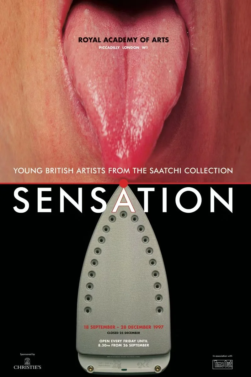
Poster for the Royal Academy’s landmark YBA show Sensation, 1997
As Why Not Associates became more established, the unfettered expressive graphic mark-making of the early years gradually gave way to a more refined aesthetic. They leaned further into moving image, with TV idents in the UK and Europe, particularly Belgium. But an edge was never too far from the surface, as evidenced by their disturbing tongue-meets-iron poster for the Royal Academy show, Sensation: Young British Artists from the Saatchi Collection.
Alongside his commercial work, Andy struck up a long-standing partnership and friendship with the monumental artist Gordon Young, who’d graduated from the RCA a decade earlier. The clash of fine art and graphic design, delivered in the public realm, gave birth to a series of breathtakingly ambitious outdoor typographic installations. These included the Burns Steps in Ayr (1998), the Cursing Stone & Reiver Pavement in Carlisle (2001), and Flock of Words in Morecambe, a typographical pavement fluttering with ornithological poems, quotations and phrases, delivered by writers and wits from Shakespeare to Milligan.
The pair’s tour de force though is undoubtedly Blackpool’s celebrated Comedy Carpet. This extraordinary feat of technical, artistic and typographic brilliance took around five years to complete and covers about 2,200m² of the town’s seafront. Its 160,000 granite letters spell out hundreds of catchphrases, song lyrics and punchlines by comedians from the days of variety onwards. It was a project tailor-made for Andy.
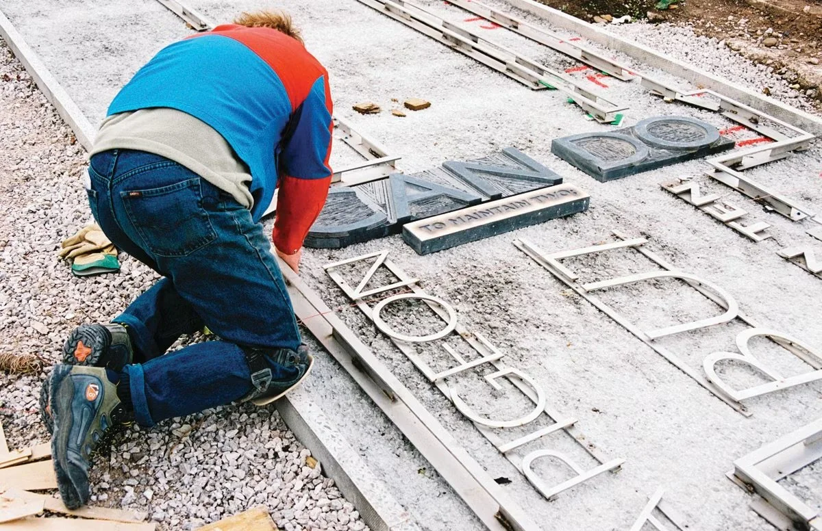
Working on the Comedy Carpet
Andy was full of amusing anecdotes and terrible jokes. Funny, perceptive and fiercely loyal to his people and passions, he had an innate and infectious curiosity about the world around him. He was fascinated by popular history and architecture, found typography, lexicology (the more arcane or suggestive the better), George Best and washing powder boxes – and that’s just for starters. He’d find inspiration, beauty and fun in the most mundane and unlikely places.
For example, he’d been a dedicated hoarder of tat (or more correctly, graphic ephemera) since his teens, amassing heaps of tacky throwaway, cards, stubs, tickets, wrappers and printed sundries, which he transformed into an astonishing book. This was nearly titled Andy’s Shite, but ended up as tat*, in 2021.
A man of great warmth and generosity, he shared his time, experience and insights freely – teaching, mentoring, giving others support and a leg-up wherever he could. Countless interns, designers and collaborators passed through Why Not, breathed in its fun-yet-tenacious spirit, and went on to achieve great things.
Andy faced his long cancer battle with typical stoicism and humour. His pint glass was always half full. The positive energy he radiated throughout his life stayed with him until the end. Design has lost a true one-off. Thanks for all the sunshine Andy.
— Jim K Davies