
Design in Football
At TC & Friends our love of football is second only to our love of graphic design and typography.
With the 2026 World Cup in full swing, we now have the perfect excuse to combine our dual loves and explore the beautiful game through a design lens.
From the branded uniform of kits to the cauldrons of passion that are stadia, here are some of our favourite designs within the beautiful game.
Tony Chambers
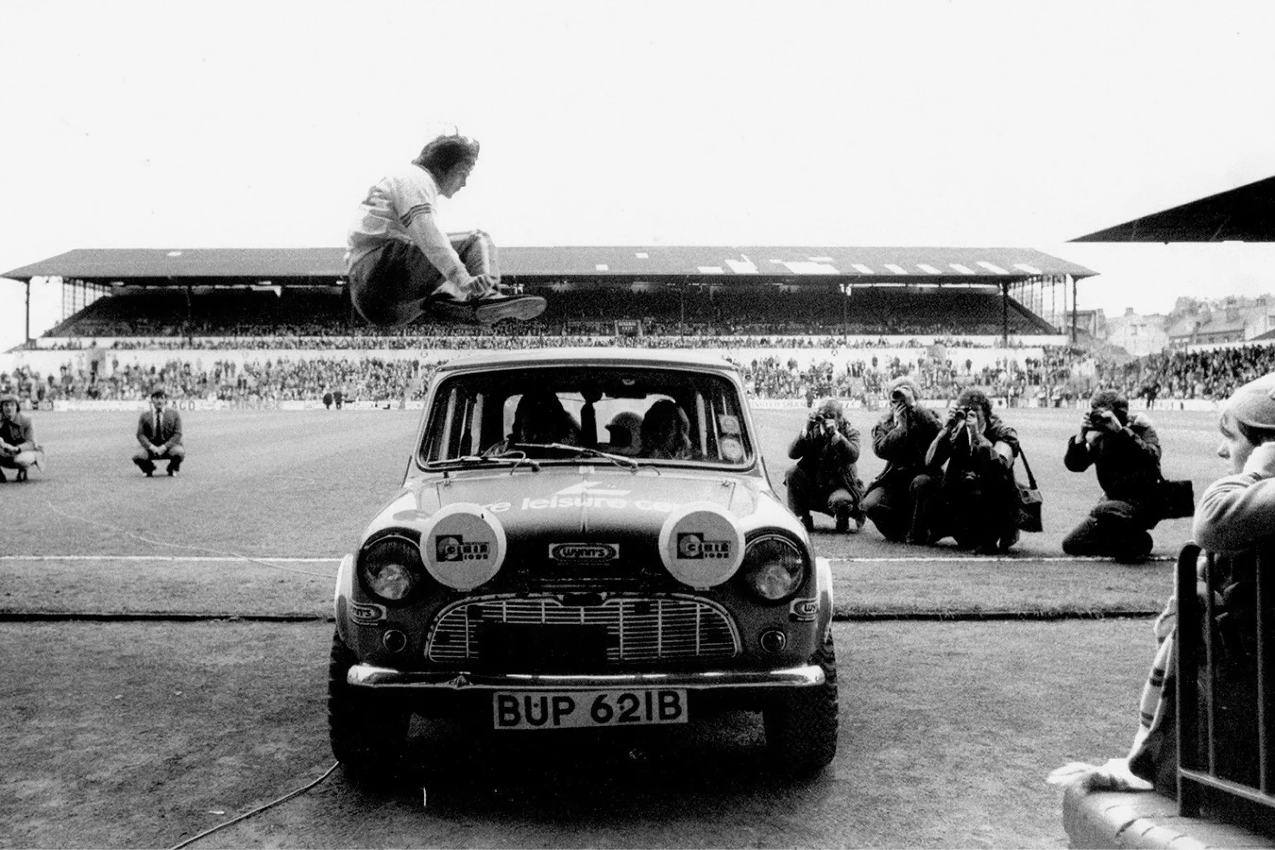
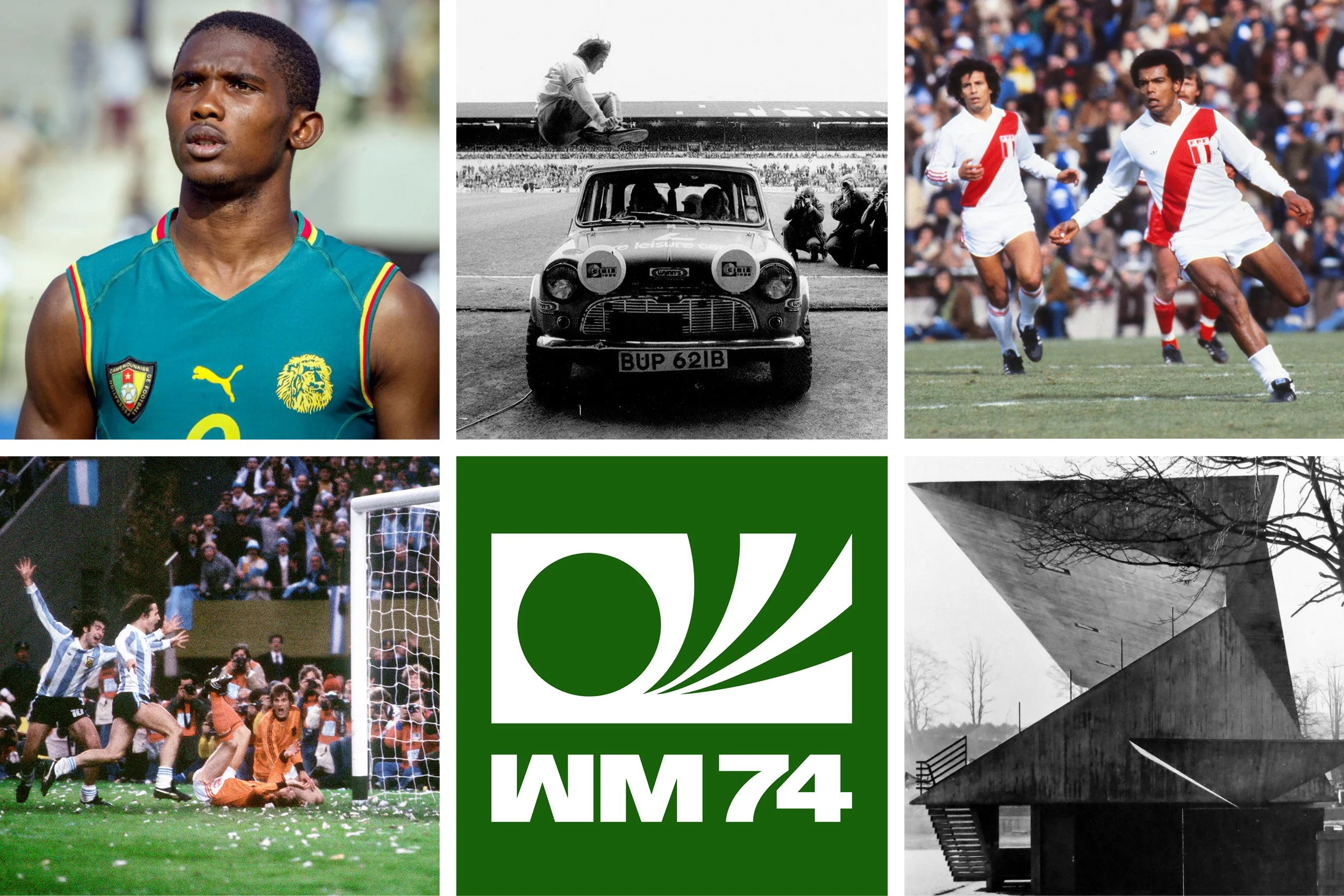
Photograph: Duncan Mckenzie jumps over a Mini at Elland Road, 1976
‘We all agree, Duncan McKenzie is Magic’
The jumping man is Duncan McKenzie, an English football star in the 1970s and one of my all-time favourite players. Duncan was famed for some unorthodox party tricks, including throwing a golf ball the length of a football pitch (approximately 110 yards) and hurdling a Mini (seen here). He’d also enjoy a cigarette or two at half time. It is unimaginable that a football club, or agent, would allow one of their prized assets to risk injury performing such a prank today. The fact that this was just before a match kick-off makes it even more incredible.
I bought this photograph from Duncan himself a few years ago. He carries a small portfolio of them whenever he attends a game; a signed print costs £5. Witnessing such a talented and successful ex-footballer touting memorabilia just doesn’t seem right. Only twenty-five years separate Duncan McKenzie’s generation from David Beckham’s. The story behind this photograph illustrates the gulf in financial rewards available from the profession they both excelled in. However, this inequality does not seem to bother Duncan. He’s always smiling, looks fit as a fiddle, and could probably still jump that Mini.
Georgia Dehn
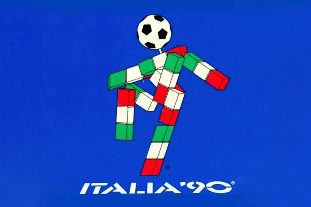
Mascot: Ciao, Italia 90
Ciao is my favourite World Cup mascot because it never really looked like a mascot. More graphic design than cutesy character, it remains the only World Cup mascot without a face. Its geometric form, tricolour palette and football head reflected the clean, confident visual identity of Italia 90. Under Luca di Montezemolo, the tournament wasn't simply promoting football; it was marketing Italy itself—its design, style, culture and creativity to the world. Alongside that perfect mix of national identity and modern graphic design, Italia 90 is remembered just as much for its emotion with Pavarotti's Nessun Dorma and Gazza's tears.
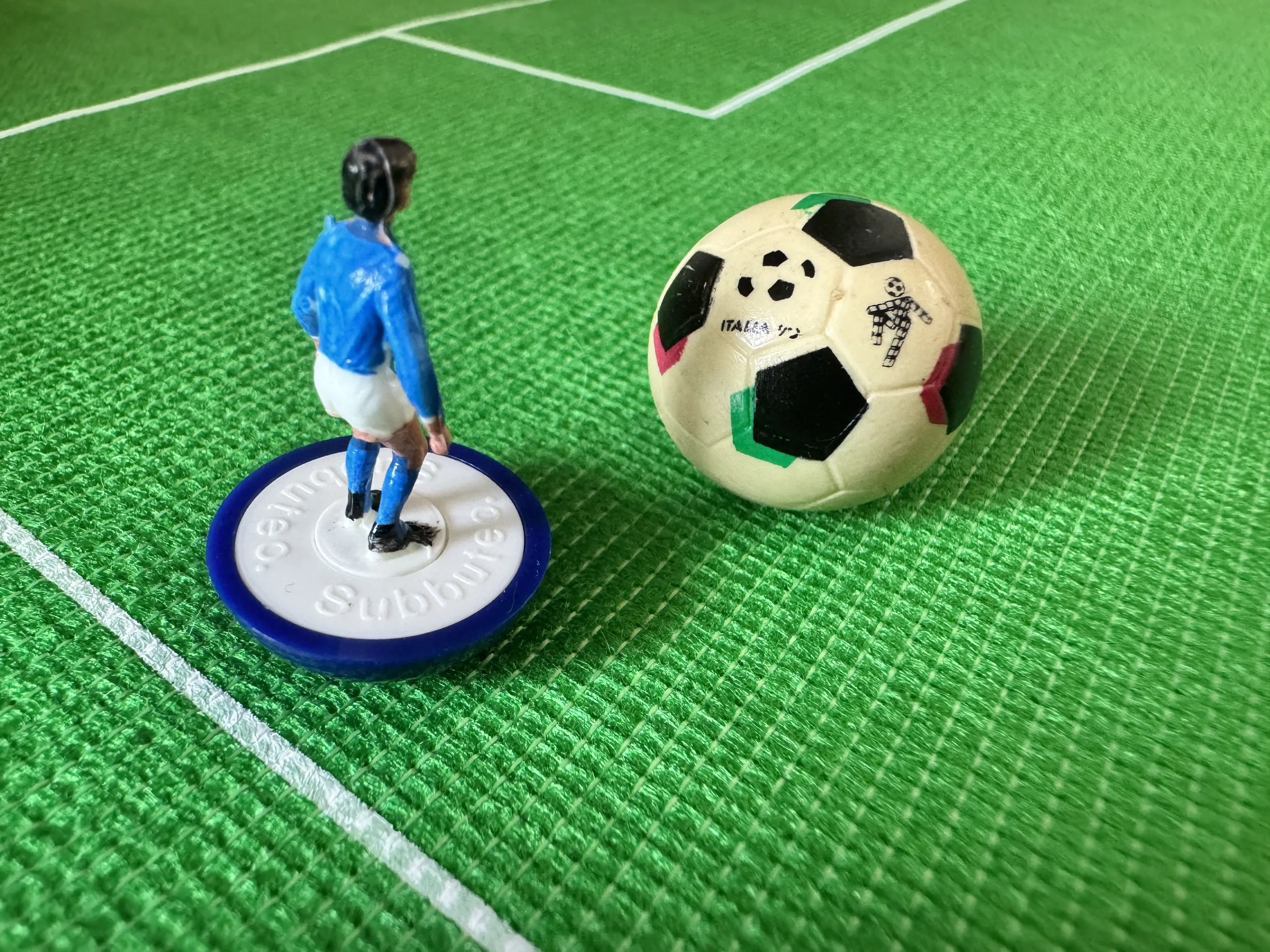
Merchandise: The flick of an era, Subbuteo
Italia 90 created a pivotal moment for Subbuteo too. The lightweight players perfected in the 1980s may have transformed the playability of the tabletop game but the official Italia 90 Subbuteo ball ushered in a new era of tournament-branded merchandise. It felt like the launch of a new commercial age for both football and Subbuteo. Thirty-five years on, it’s great to see Subbuteo making a comeback as a brilliantly social alternative to video games.
Callum Majekodunmi-O’Hara


Football Stadium: San Siro
I went to watch Inter Milan beat Cagliari 3-1 last year, and the San Siro is, without doubt, the ultimate love letter to football. Walking up the external spiral ramp to enter the ground, you hear the chorus of the crowd getting louder with every loop. You then arrive at the Curva Nord, looking out onto an arena primed for football. It’s a thumping, colossal, and beautiful reminder of why we fall in love with this game.
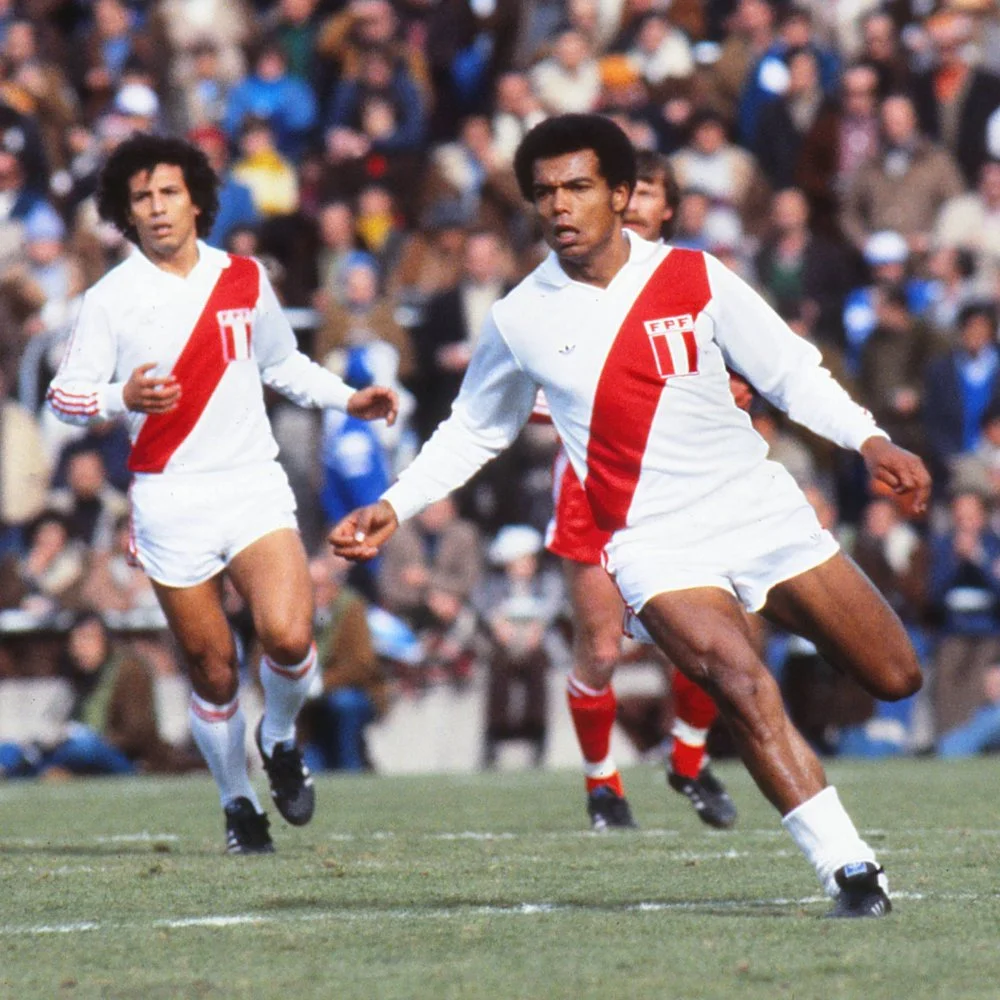
Classic Kit: Peru 1978
I’m a big fan of sash kits in general, but Peru absolutely own this look on the international stage. First introduced in 1936, the distinctive red sash on the white shirt has become synonymous with the team. This 1978 World Cup edition adds a classic 70s collar. Simple, striking and timeless.


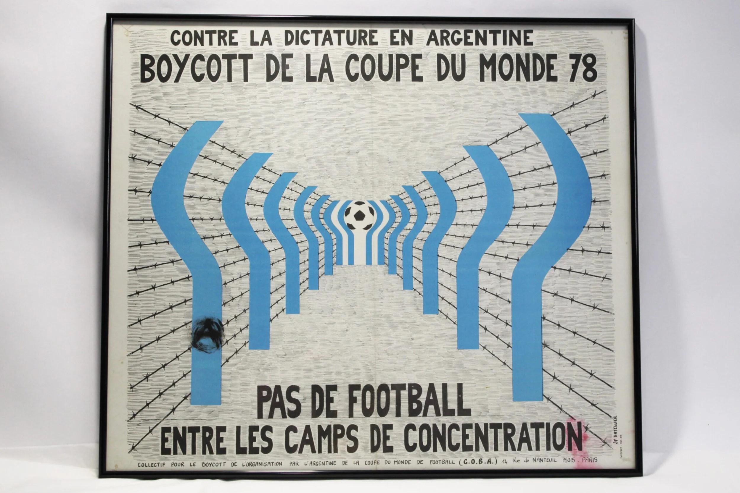
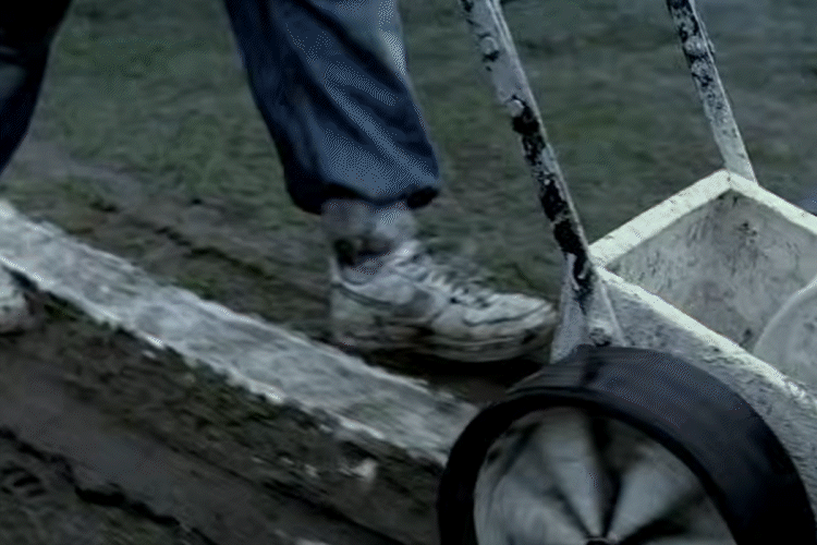
Tournament: The 1978 World Cup
Ticker-tape, short-shorts and dot-matrix displays – looking back at my dad’s favourite tournament, the 1978 World Cup is one of the most recognisable in history. But the backdrop to this tournament was Argentina’s ruling military junta who used this event to whitewash their human rights abuses. This prompted Amnesty International to launch a campaign exposing the reality on the ground.
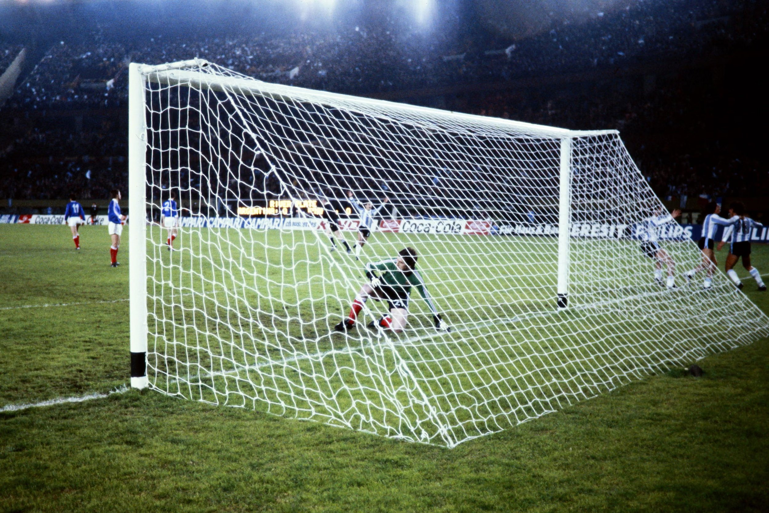
One of the most fascinating visuals of this World Cup was the black tape on the base of the goalposts. Implemented by stadium groundsmen as a form of remembrance for the ‘disappeared’, it was a subtle protest that the ruling generals were clueless about.
Fred Cochran
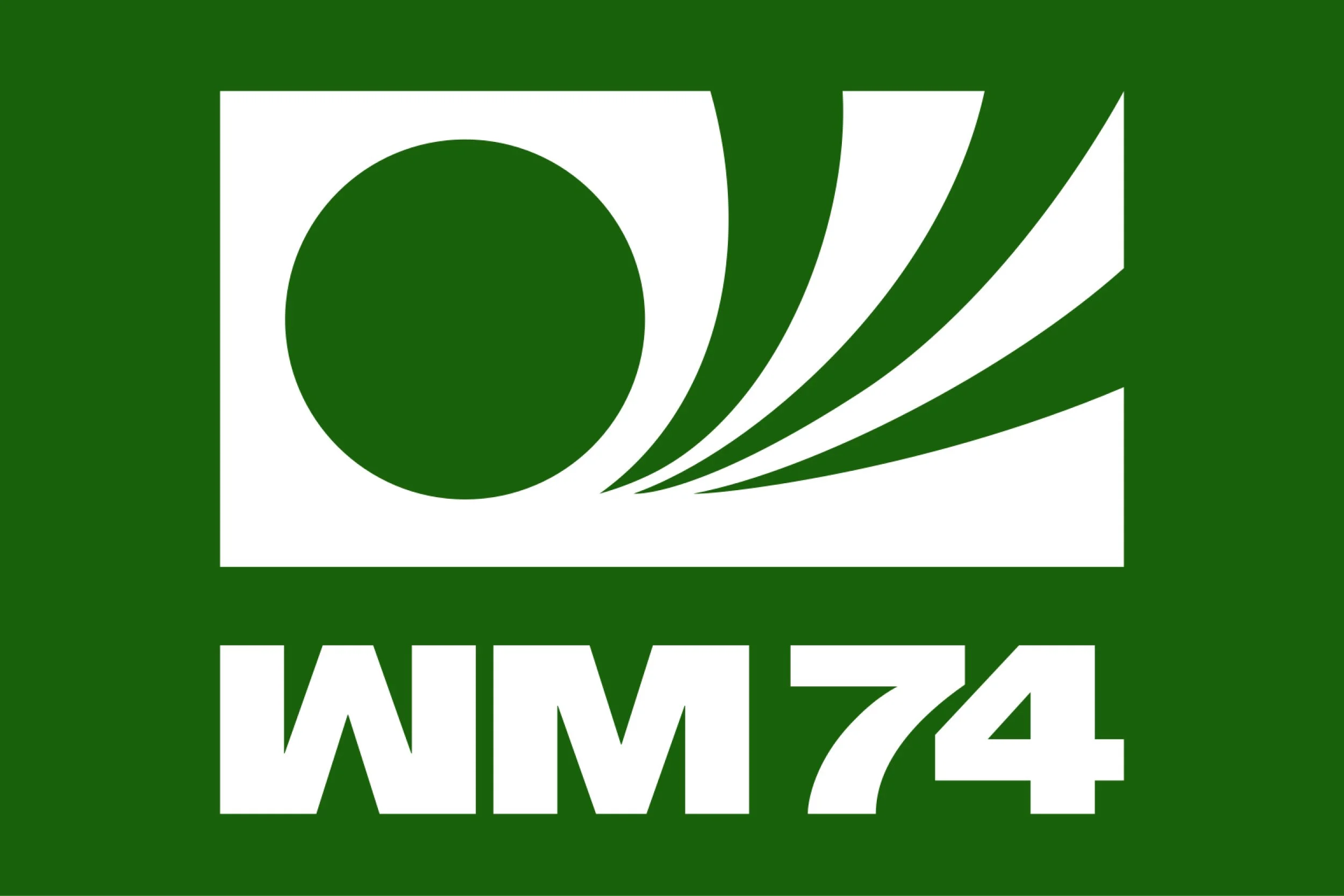
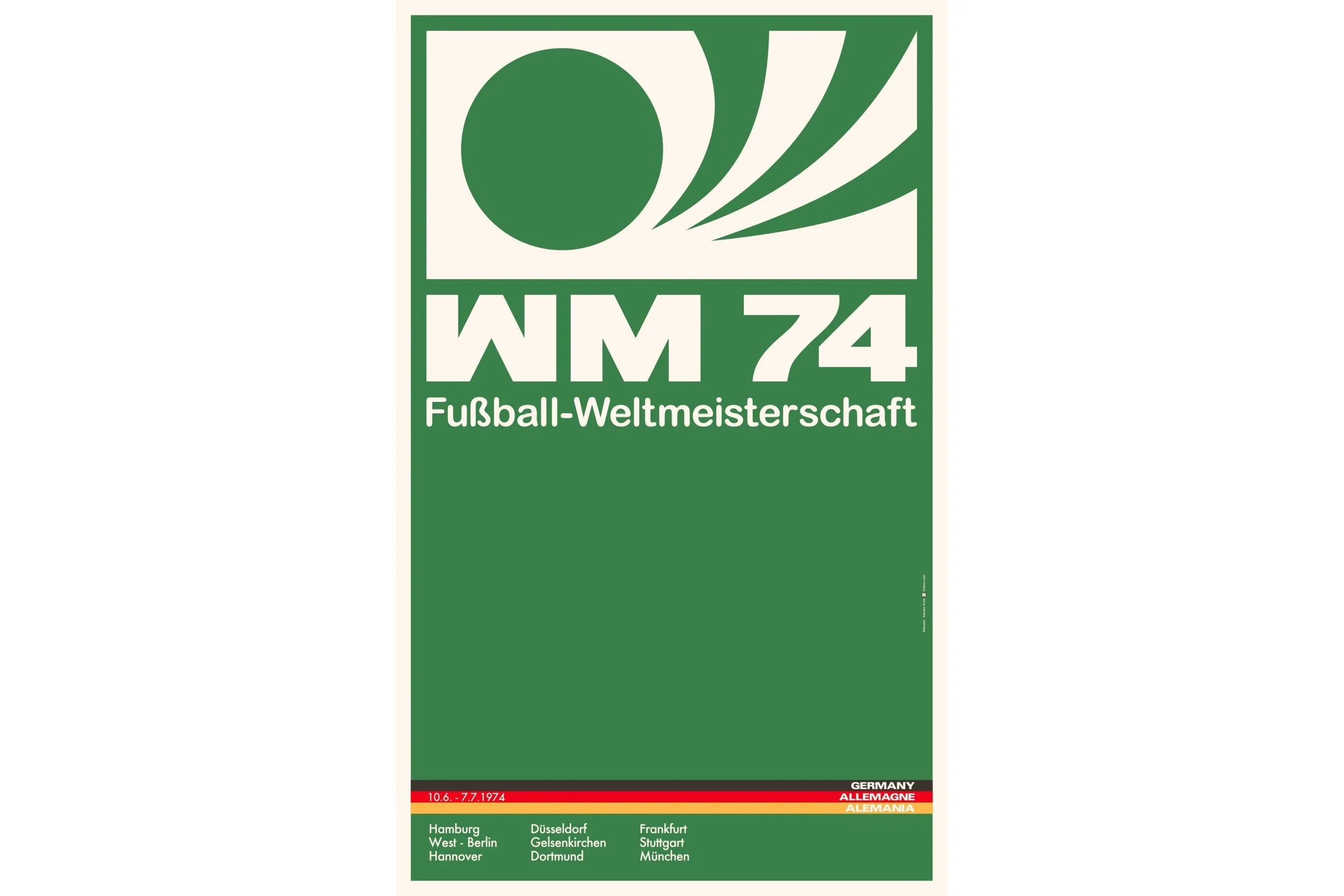

Identity: The 1974 World Cup
At the height of post-war German Modernism, the identity for the 1974 West German World Cup brought bold geometric forms and clean Swiss typography to the beautiful game. Pairing these simple graphics with striking impressionist paintings by Horst Schäfer created an iconic design for the tournament, capturing the aesthetics of the time.
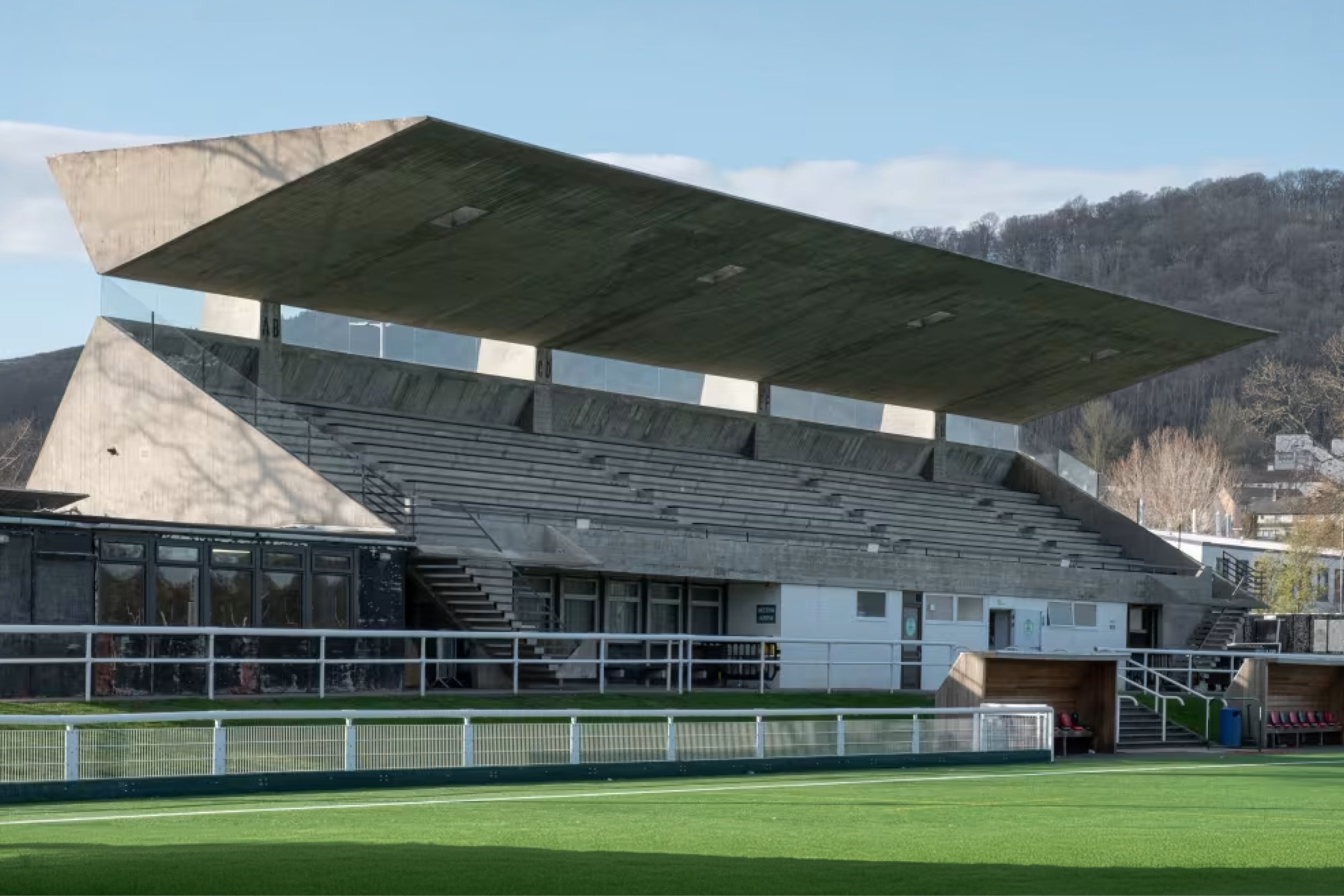
Stadium: Netherdale in Galashiels, Scotland
Designed in 1963 by Peter Womersley, the main stand at Netherdale football ground features a striking folded cantilever roof, now recognised as an icon of Scottish brutalist architecture. Compared with today’s stadiums, it’s a reminder that great design shouldn’t be reserved for the biggest stages. If football’s not quite your thing, Farnley Hey, designed by Womersley in 1954, offers a slice of Californian cool in West Yorkshire.

Trophy: Royal Shrovetide Football
Far from the gilded trophies of today, the prize for Royal Shrovetide Football game (played each year since 1683), is the ball itself. Hand-painted each year, it sits on the boundary of sporting equipment, folk art and ceremonial trophy.
Zulum Elumogo
Advert: Nike’s Write the Future – 2010 World Cup directed by Alejandro González Iñárritu
Nike’s ‘sliding doors’ style ad for the 2010 World Cup had the all energy and heart-pumping thrill of a blockbuster film concentrated into a three-minute advert.
Whilst there’s probably some element of teenage nostalgia in my choice, this ad contained the finest players in the world at the time as well as expansive world-building, all of which made for a powerful cultural impact.
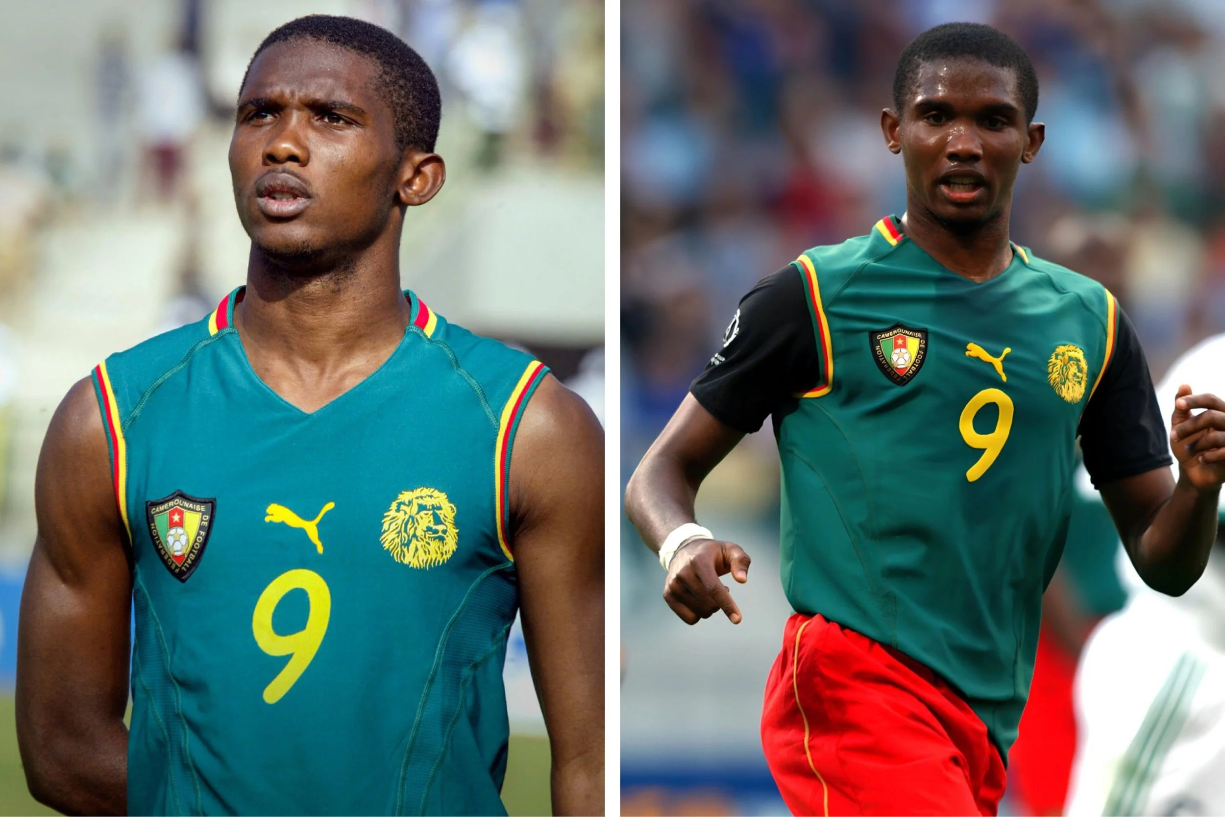
Classic Kit: Cameroon 2002
In a daring design that reimagined the form, Puma created a sleeveless kit for the Cameroon national team in 2002.
Despite the imagination and audacity to do something different and unexpected, the innovation was short-lived. It caused so much uproar with FIFA that they stitched black sleeves to the top when they wore it at the World Cup in 2002. Boooooooooo
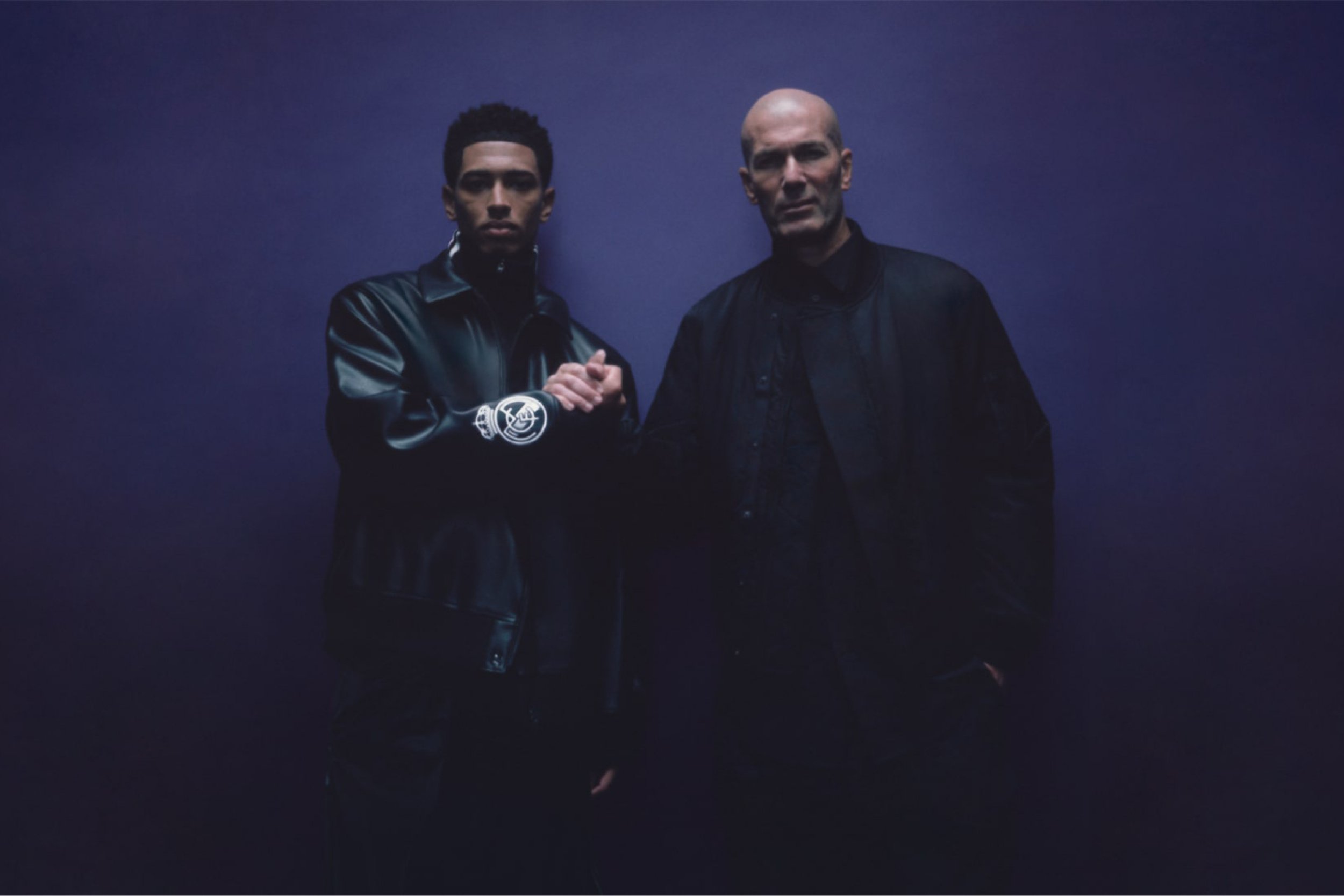
Photoshoot: Adidas Y-3 and Real Madrid Travel Collection - Jude Bellingham x Zinedine Zidane by Gabriel Moses (2024)
To me, this shot by Gabriel Moses for Adidas Y-3 and Real Madrid is perfect.
This is the Jedi and the Padawan, the master and the apprentice – and it’s all said with their brooding gestures: Jude’s furrowed brow, intentful gaze and clasped hands; Zidane’s stern yet assured posture. The purple gradient behind them effusing royalty, rarity and magic.
This is the glorious past and the glorious future. The king and the heir apparent. The textbook and the next chapter. The blessing conferred.
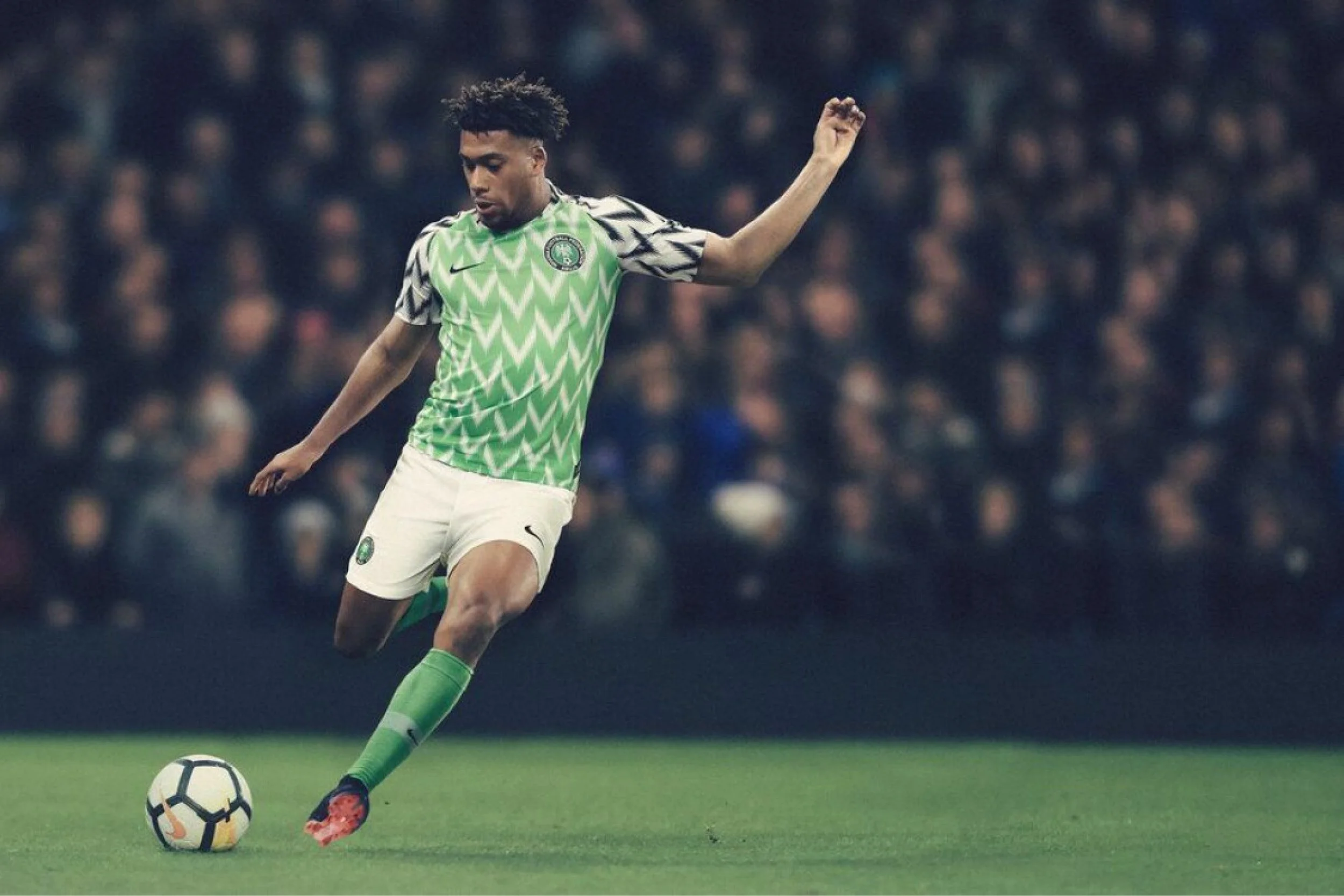
Contemporary Kit: Nigeria 2018
The 2018 Nigeria kit was cultural expression distilled in garment.
Its remarkable success symbolised the beautiful game’s unique ability to unite community, with Nigeria’s large international diaspora finding a common uniform and cause for celebration.
Selling astonishing 3 million shirts in pre-sale, the kit transcended football and became a streetwear staple – an essential capsule item of cultural clothing worldwide.