Al-Mujadilah
A visual identity and branding system for Al-Mujadilah – a new landmark center & mosque for women in Doha, Qatar.
In a region where tradition and modernity continue to intersect, a quiet but radical idea took shape: a mosque for women.
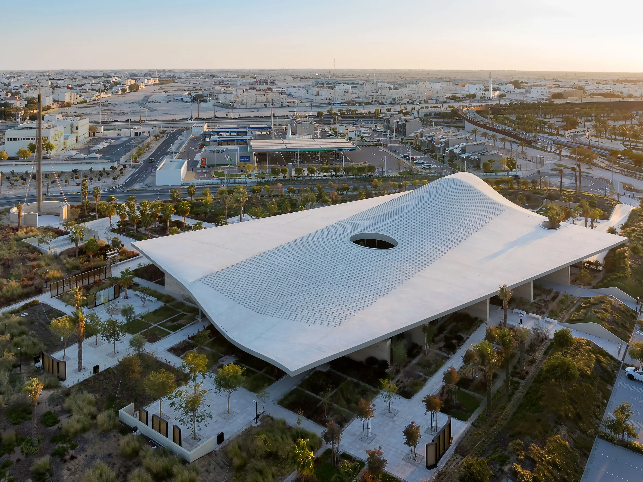
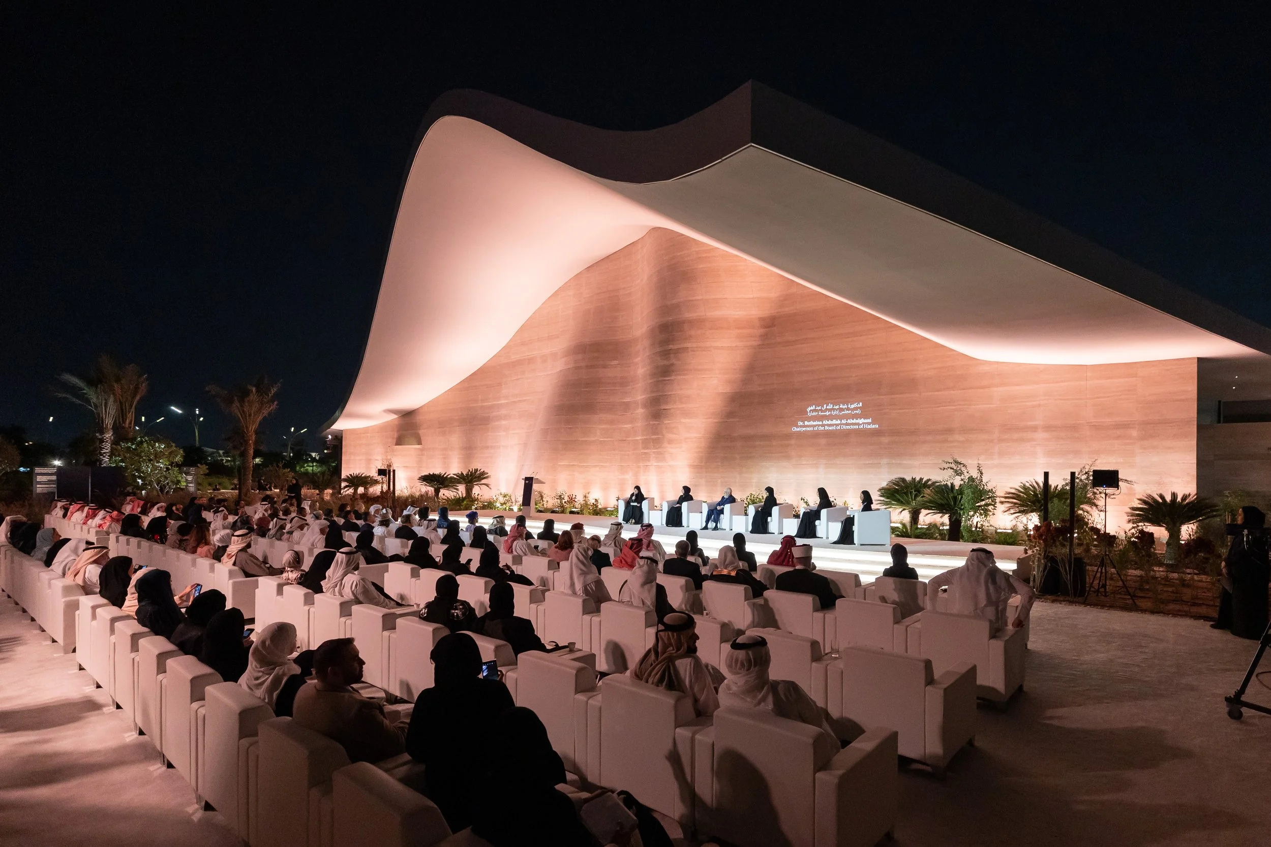
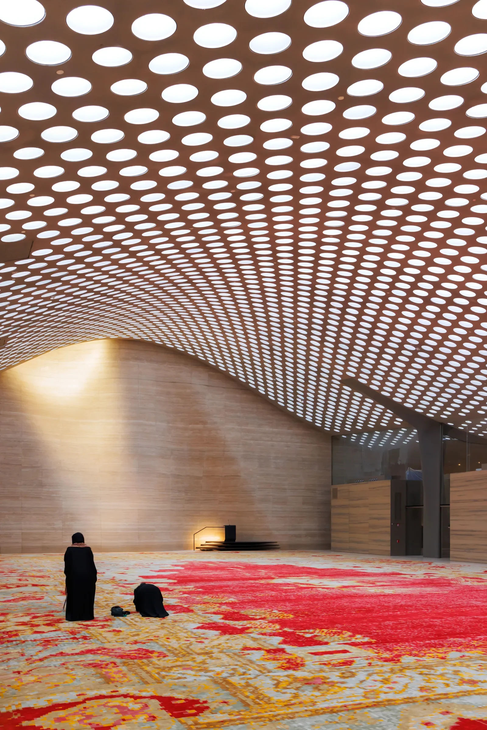
Founded by Her Highness Sheikha Moza bint Nasser and opened in Doha, Qatar in February 2024, The Al-Mujadilah Center and Mosque for Women is a contemporary space for learning, connection, community and empowerment.
TC & Friends were invited to give this innovative new vision a powerful visual identity. We worked closely with the Qatar Foundation team and world-renowned architects Diller Scofidio + Renfro to shape a full brand system for Al-Mujadilah: a bilingual identity and website, wayfinding and signage, and a suite of print and digital materials designed to welcome, inform, and inspire.
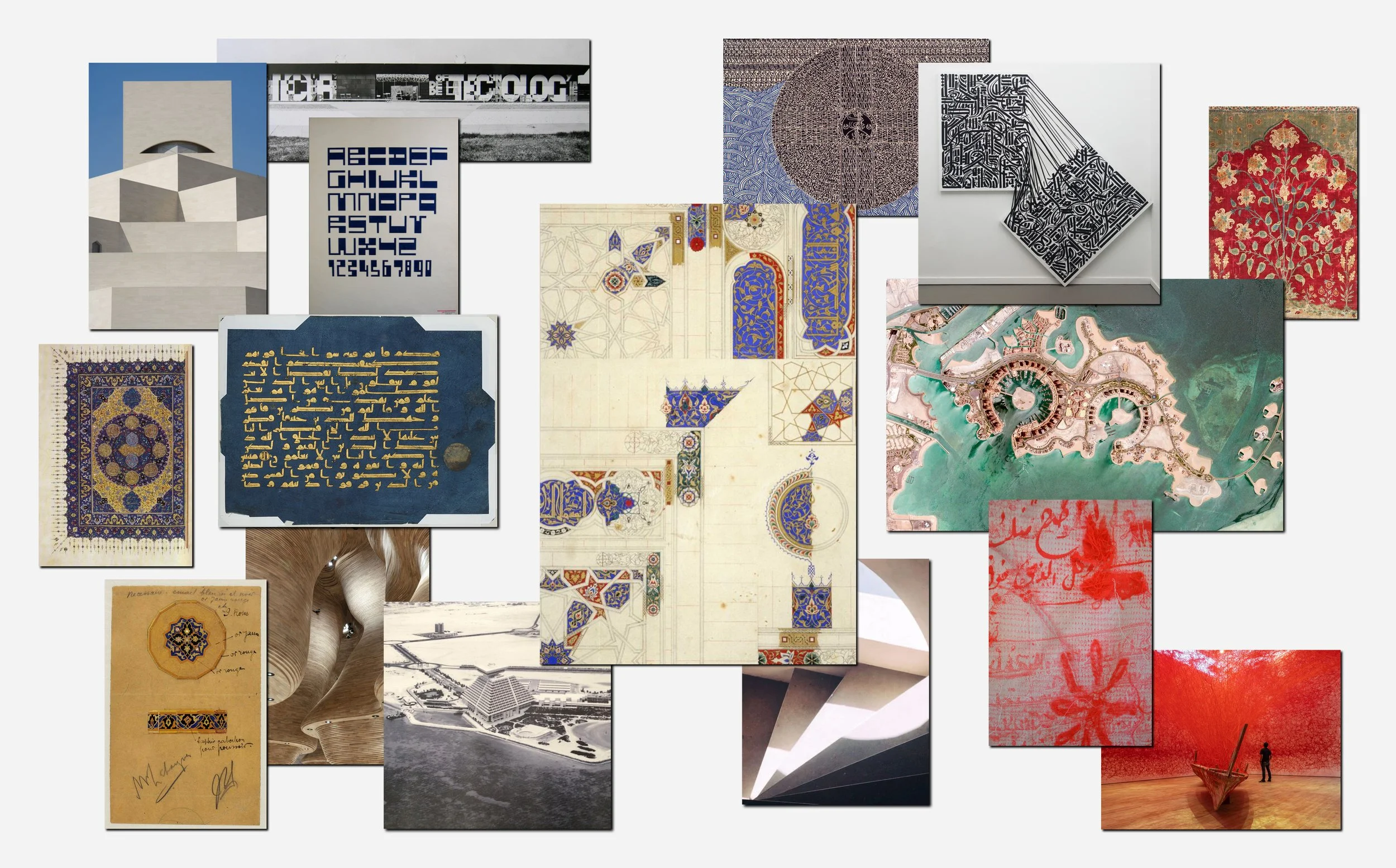
The name Al-Mujadilah, “She Who Debates”, anchors the project in a legacy of courageous scholarship. Our design response reflects this duality — it is rooted in Islamic history yet forward-facing.
Client
Qatar Foundation
Services
Branding
Visual Identity
Brand Strategy
Logo Design
Web Design
Merchandise Design
Architecture
Diller Scofidio + Renfro
Structural Engineering
Buro Happold
Logo
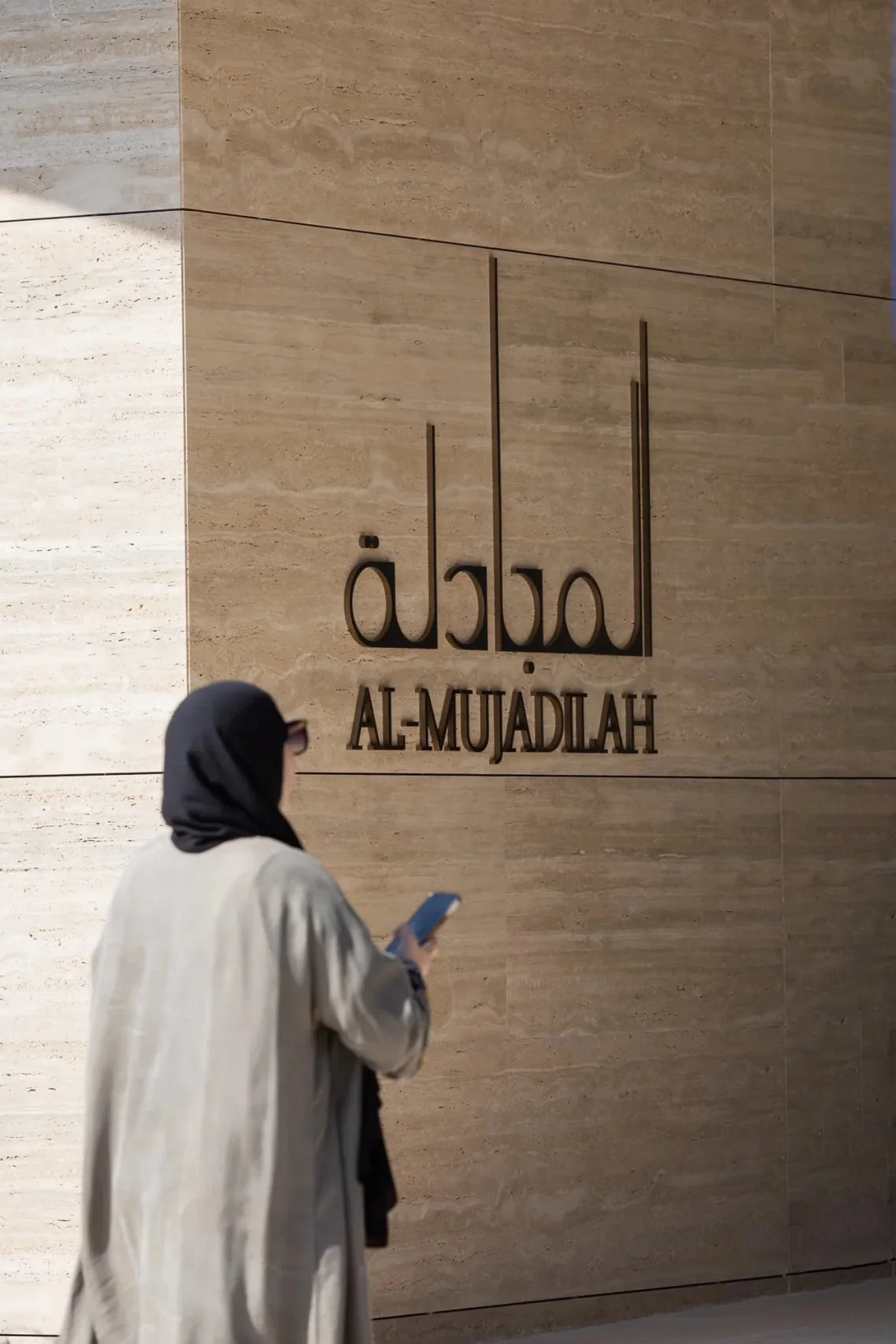
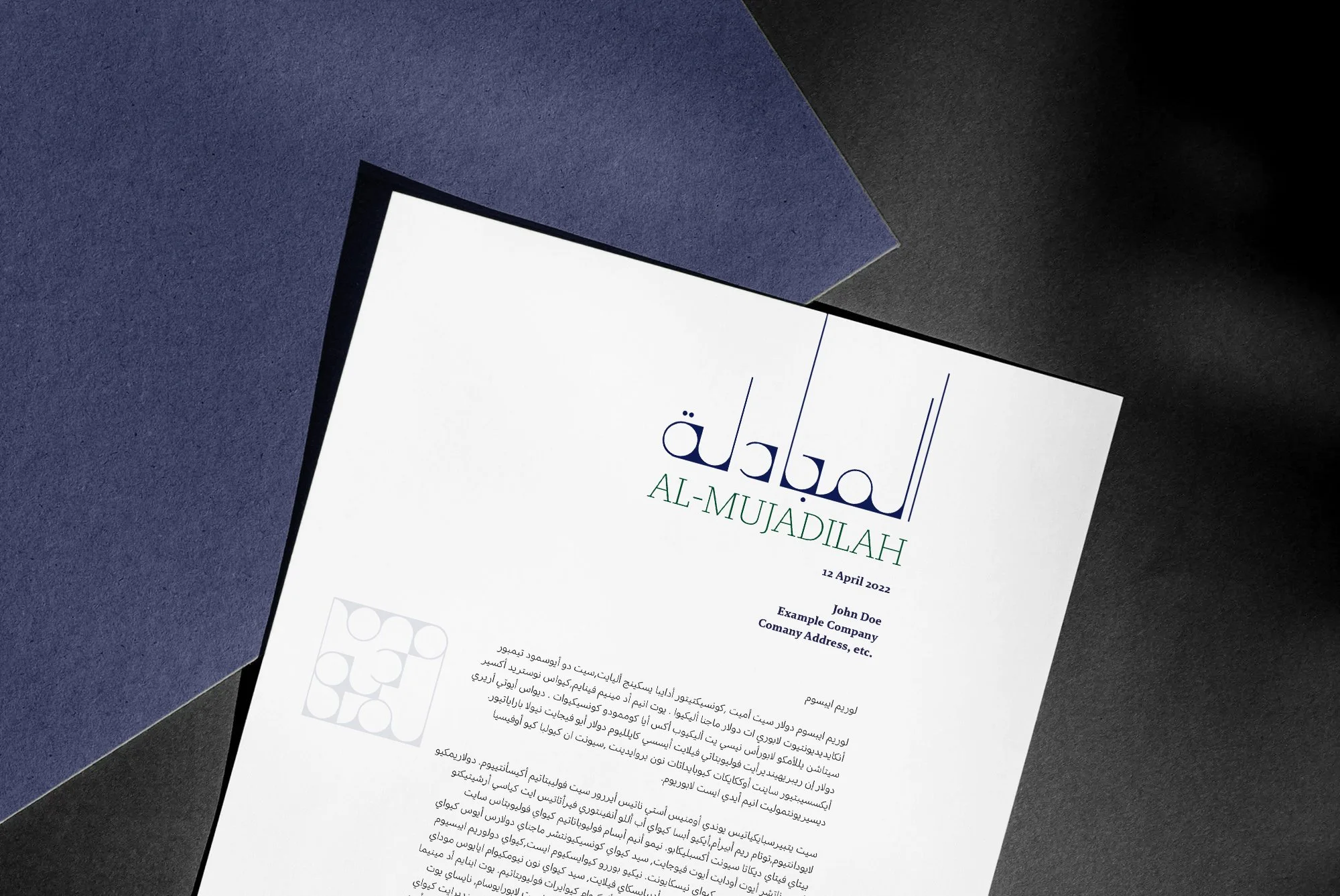
The bilingual logo captures the flowing symmetry of Arabic calligraphy reflecting the architecture’s spatial openness and sense of invitation.
In this contemporary context, we imagined how we could push the boundaries of abstraction even further, by melting the Arabic typeform into the essence of movement and modularity – giving this process the name of Arabstraction.
Colour
Al-Mujadilah draws from traditional and contemporary references to create a balanced colour story.
Our starting point was Al-Azraq. In Islamic tradition, blue often signifies the impenetrable depths of the universe. Drawing from Owen Jones' Grammar of Ornament, we created a colour study centered in Islamic artistic tradition.
The colour palette embodies the spirit of Al-Azraq but also draws parallels to the surrounding landscapes of where the Al-Mujadilah centre is situated. Giving a nod to not just the historical context of the ethos behind Al Mujadilah, but also drawing references to its geographical location.
Overall this created a balance of simple and clear communication devices but also introduces hints of boldness and refreshing hues with a vibrant shellfish red and a vivid turquoise tone in its palette. With its brand application, the colour palette creates an element of boldness and surprise but also familiarity and clarity with the use of the Navy Blue and Deep Green.
Typography
The primary font Brando Arabic has features of delicacy and geometrical elegance. We implemented a secondary font called Adelle Sans Arabic designed by Azza Alameddine, an Arab woman, thus embracing integrity in the brand values and also promoting the knowledge and skillset that the women of that region continue to hold. The goal of Azza’s design work is ‘to preserve the identity of the Arabic script and culture’.
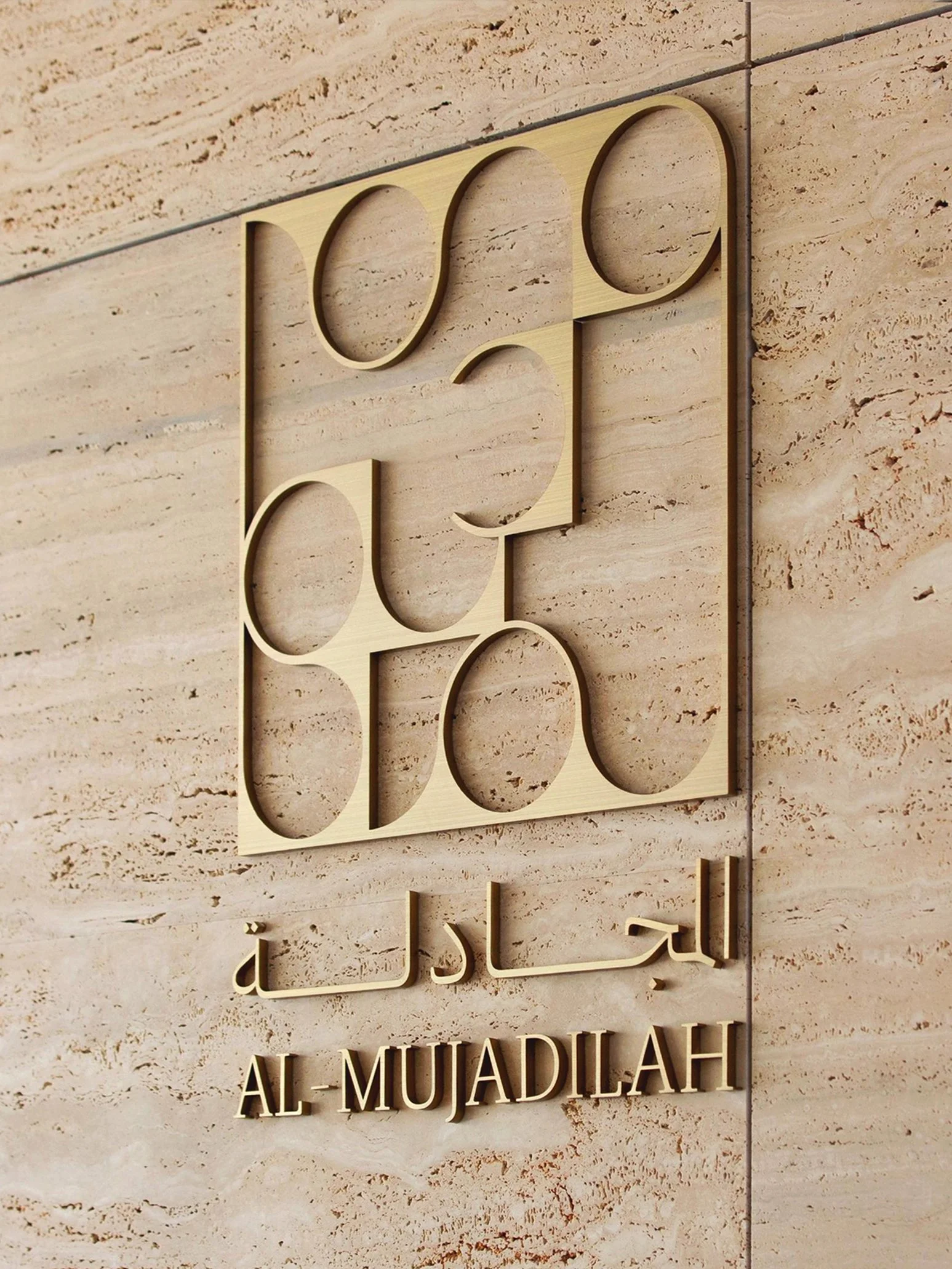
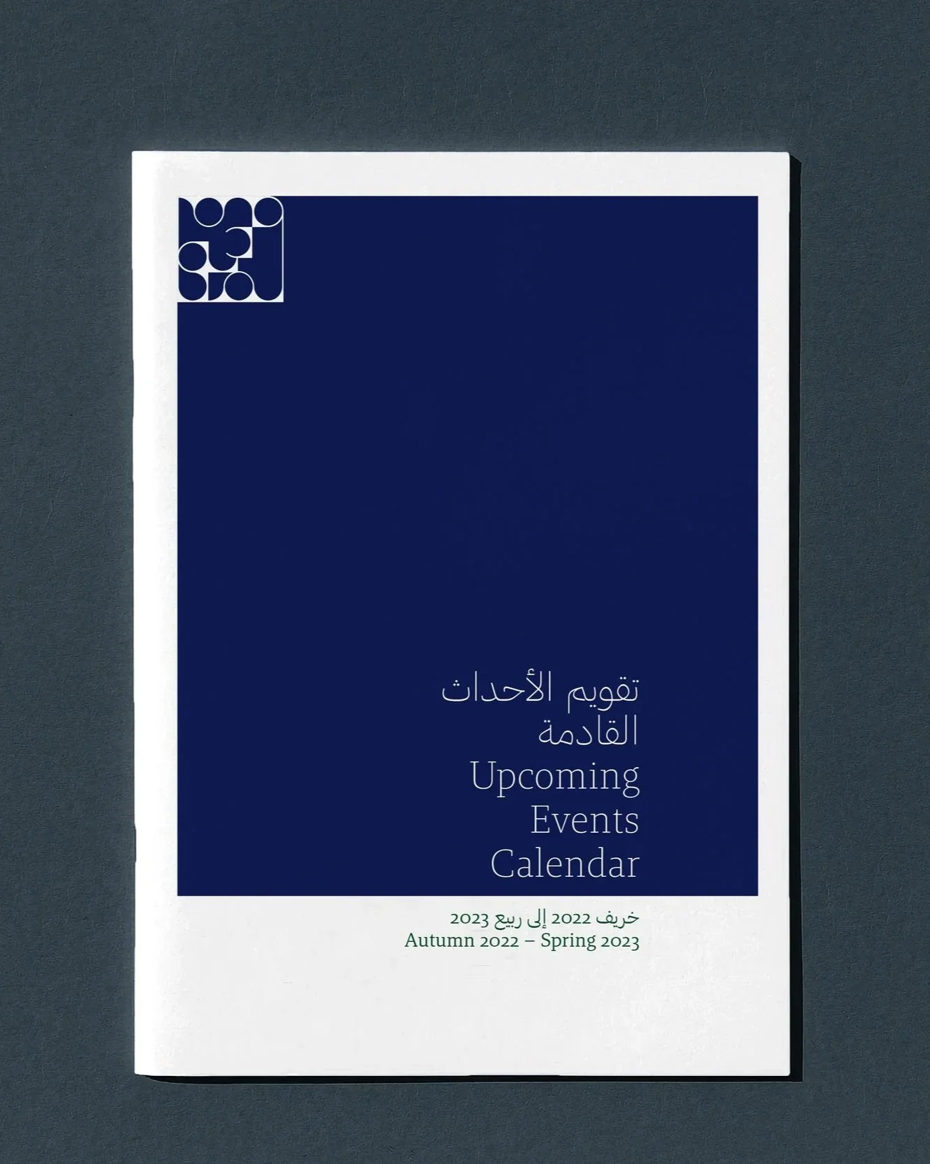
The emblem plays with angles and geometric shapes as a key device in its visual language, creating a playful spirit of lending itself as sometimes a symbol and sometimes a mosaic-like pattern.
The graphic elements in the Al-Mujadilah brand recipe aim to honour traditions but at the same time set the tone of a transformative and informative language through contrasting yet harmonious ingredients. This can be seen in the versatility of the typeface selection, the colour references as well as the push and pull Arabstraction within the logotype.
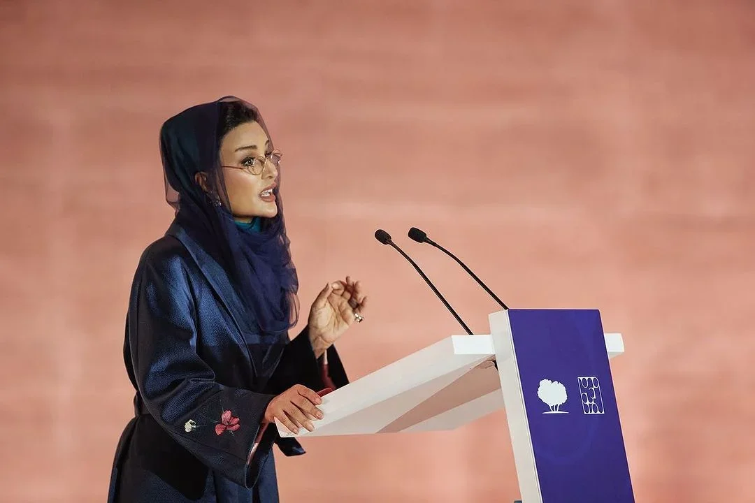
Sheikha Moza bint Nasser inaugurated the Al-Mujadilah Center in January 2024
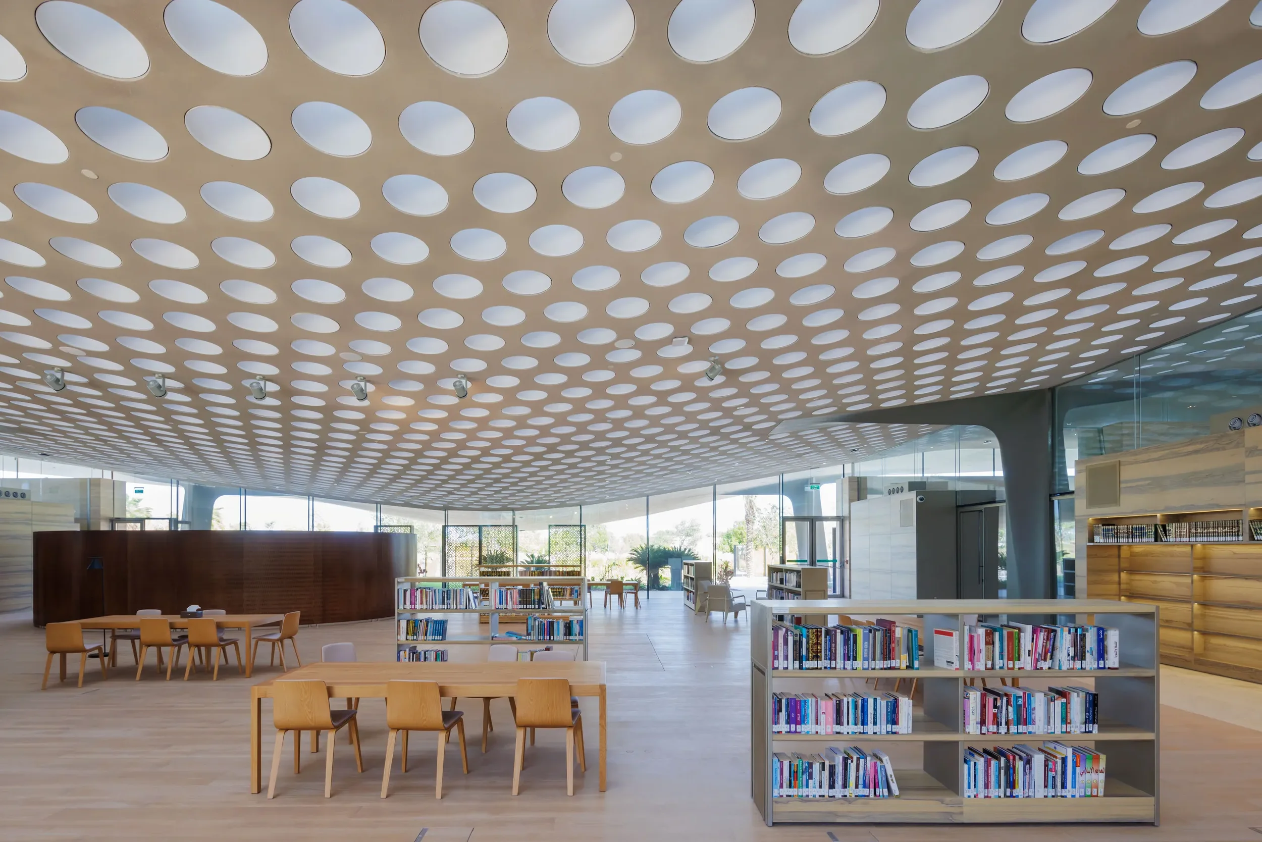
The creation of Al-Mujadilah was inspired by the traditional role of the mosque as a pillar of society. The center and mosque is home to classrooms, a library, gardens, and gathering spaces — designed to hold everything from book clubs to legal workshops, from wellness circles to academic research.
We developed a system that could flex across these diverse functions, balancing spiritual depth with everyday relevance.
As with all community-first work, collaboration was key. Our deepest thanks to our partners Bakhtawer and Betty of Plan B Creative Studio whose insights and creativity helped shape a project that will serve generations to come.
Related projects
ETEL
Sotheby’s
The Nigerian Design Group
IN’EI

